|
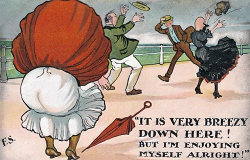
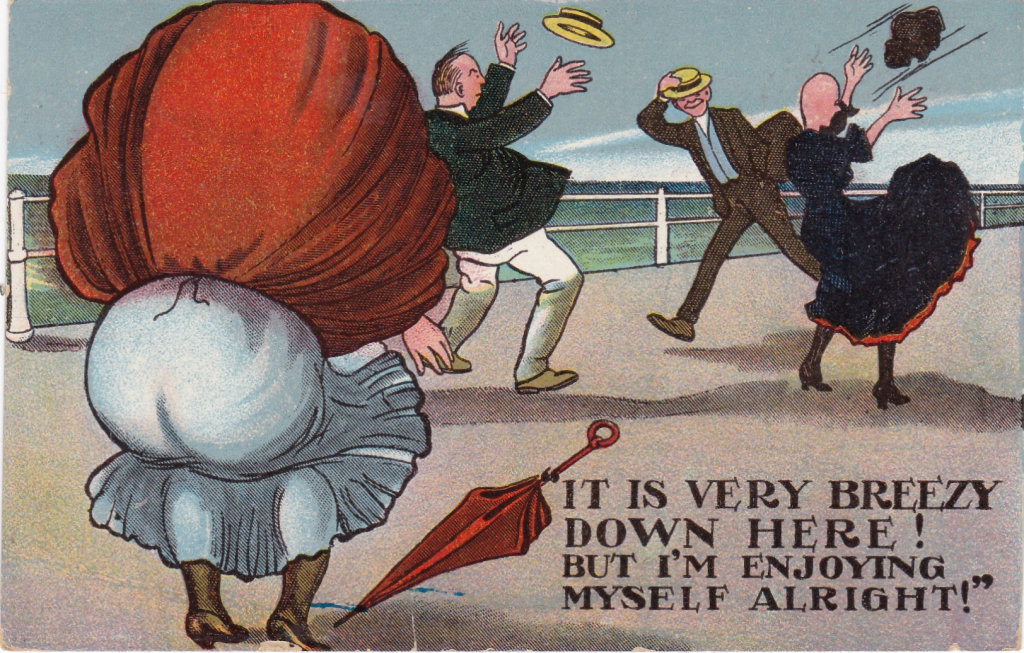
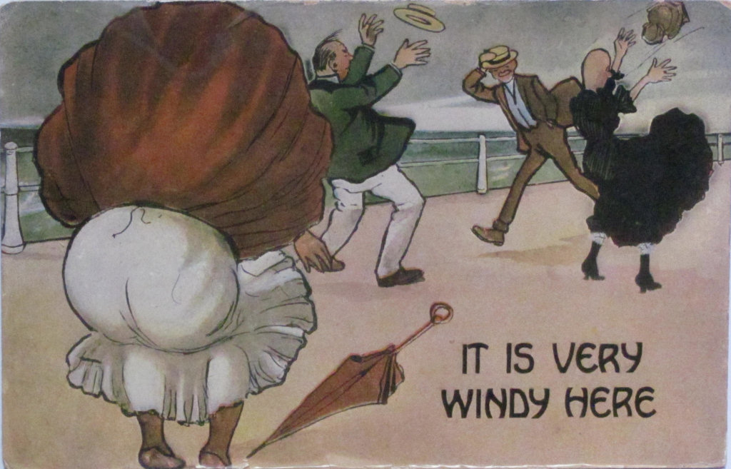
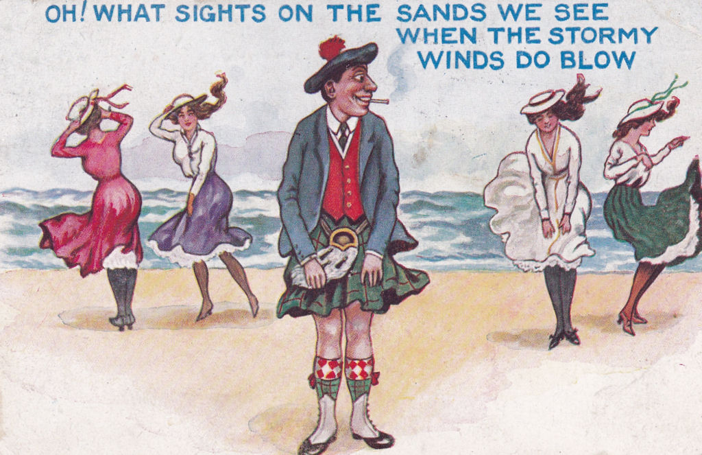
Topics "It is very Breezy" |
|
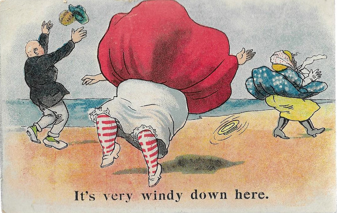
This card is one of a set of six cards by "F S", with a "Down Here" theme which was first published in 1907. It proved very popular and was frequently reprinted - usually without the "F S" signature - and also closely copied. In particular copies were made slightly later by very well known artists, "Comicus" and Donald McGill. Douglas McGill also repeatedly used elements of the picture in later cards.
Below I give details of the known variations and would expect there to be copies for other named seaside resorts. There may also be more "Pirate" copies!
|
||||||||||||||||||||
|
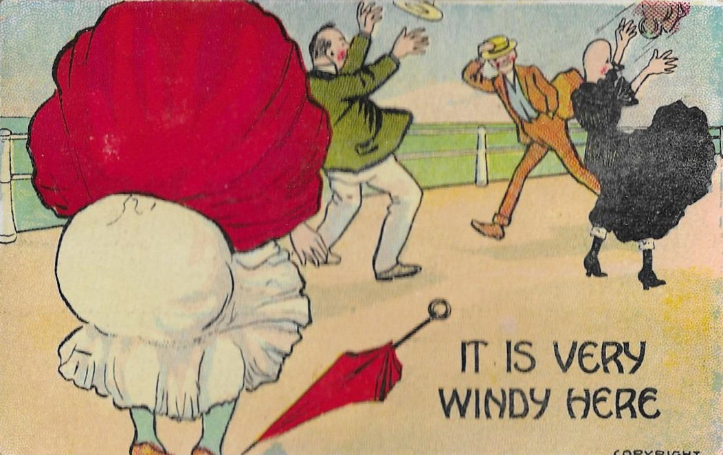
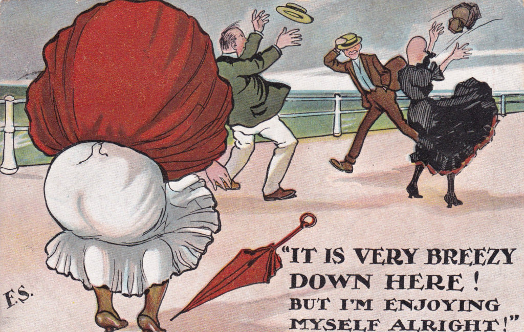
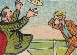
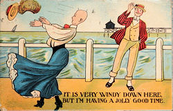
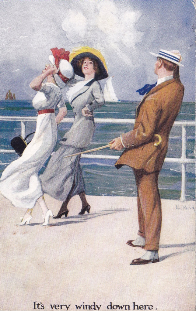
Version 1 - "It is very breezy down here" signed by "F S" Engraving 1 |
||||||||||||||||||||
| The London View Company Ltd went out of business in August 1907, so this card must have been printed in mid-1907 - although its distribution may have been delayed by the closure. | ||||||||||||||||||||
|
|
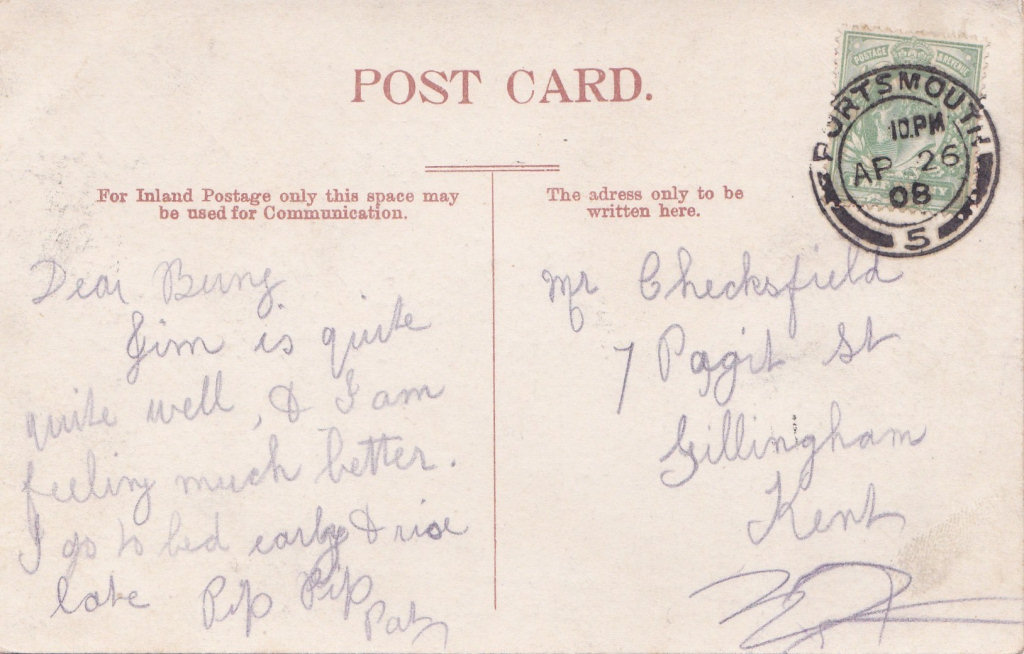
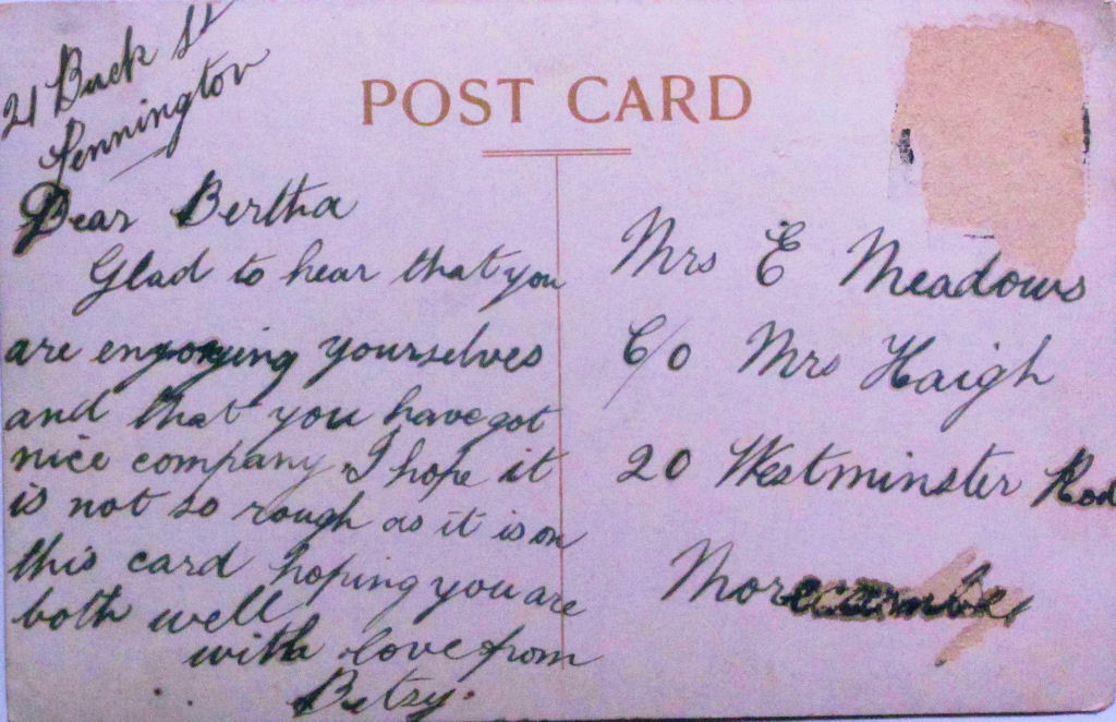
It is very breezy down here But I'm enjoying myself alright! Signed "F S" No Publisher Posted 26 April 1908 |
|
||||||||||||||||||
 |
It is very breezy down here But I'm enjoying myself alright! Signed "F S" The London View Company Ltd., E.C. 1908 |
|
||||||||||||||||||
|
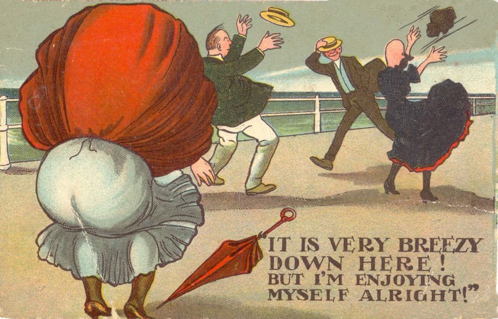
Version 1 - "It is very breezy down here" unsigned Engraving 2 The fact that these two cards appear to come from the same engraved plate supports the idea that in the case of the "Green Backed " cards the plates were retained and reused. |
||||||||||||||||||||
|
|
It is very breezy down here But I'm enjoying myself alright! Unsigned No Publisher - Printed in Germany Lined Address circa 1909 Posted 4 November 1911 |
|
||||||||||||||||||
|
|
It is very breezy down here But I'm enjoying myself alright! Unsigned (PC II) 701 - No Publisher 8 July 1913
A number of "F S" related cards were reprinted about 1913 and in particular numbers 698 and 699 are also from the "Down Here" set. |
|
||||||||||||||||||
|
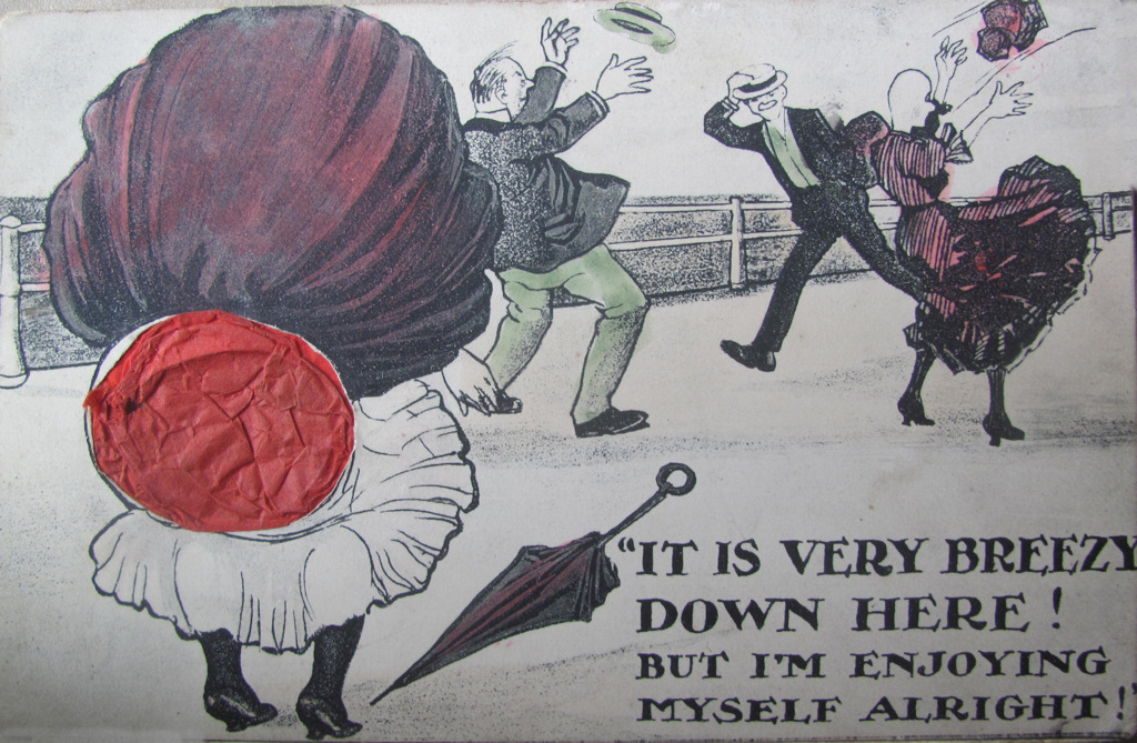
Version 1 - A "Hold to Light" Variation |
||||||||||||||||||||
|
|
It is very breezy down here! but I'm enjoying myself alright Unsigned No Publisher |
|
||||||||||||||||||
|
This card is a differently coloured version of the previous cards - and may even have been an experimental prototype, as it really is quite crude and impractical. It has a large red translucent inset which take up part of the address space - and I have not seen this done in any other "F S" cards, or in any cards produced by the London View Company (Ltd). While the stamp box says the postage is a half penny the large hole in the address area suggests that the post office would not have treated it as a standard post card and it would be charged 1d. Date Estimated 1906-7 but could be later. |
||||||||||||||||||||
|
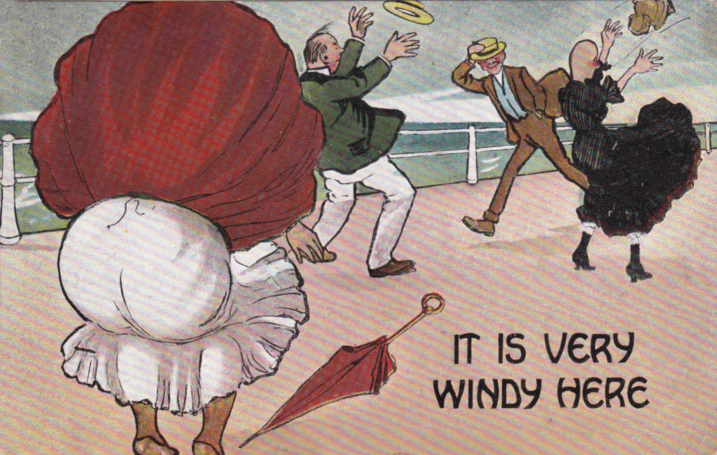
Version 2 - "It is very windy here" unsigned |
||||||||||||||||||||
The following three cards all appear to have come from the same master, and one had a back appropriate to Vertigen "F S" cards circa 1908. |
||||||||||||||||||||
 |
It is very windy here Unsigned No Publisher similar to Inland Vertigen [bigger space below words POST CARD] Posted 22 July 1908 4 August 1908 |
|
||||||||||||||||||
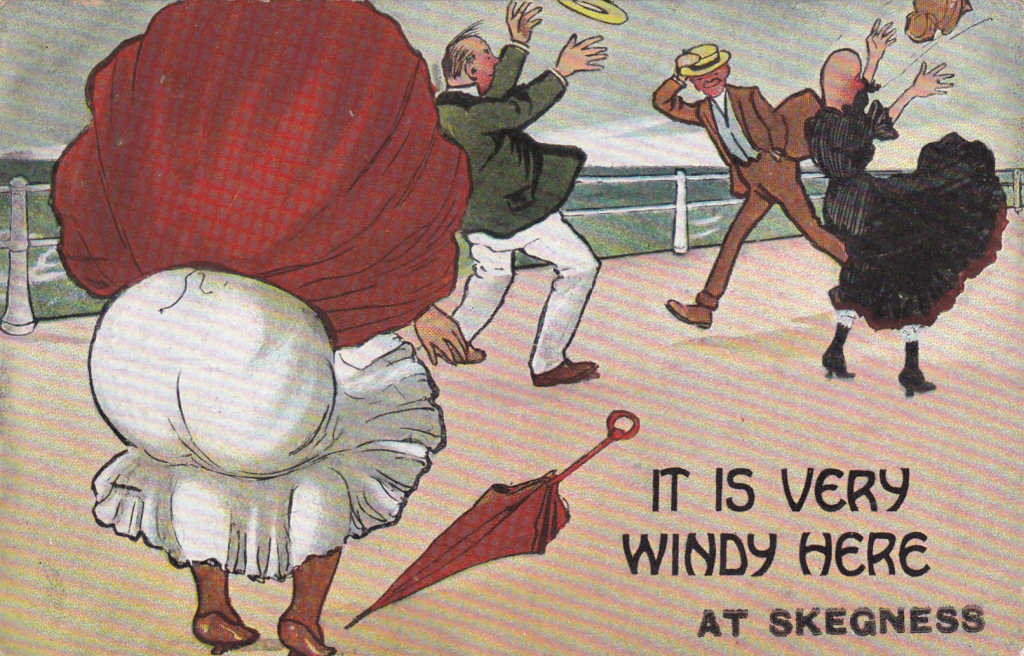 |
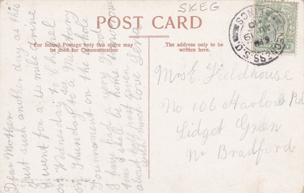
It is very windy here at Skegness [printed separately] Unsigned No Publisher Posted 19 August 1910 |
|
||||||||||||||||||
|
|
It is very windy here Unsigned No Publisher glazed surface Unidentified simple back [Version seen dated 10 June 1909] |
|
||||||||||||||||||
|
?? |
Possible Variations: With the name of other seaside resorts added ?? and is there a Vertigen labelled version. |
|||||||||||||||||||
|
Version 2 - Different colour printing technique |
||||||||||||||||||||
 |
Note the clear dots of colour on this printing (right) - although the black lines are identical. So far this is the only "F S" card linked in any way to this publisher. |
|
||||||||||||||||||
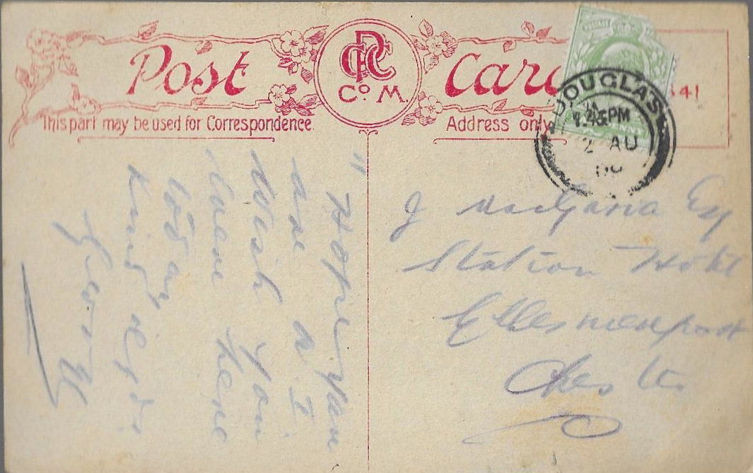
 |
It is very windy here Unsigned Published by CPC Co M 2 August 1909? |
|
||||||||||||||||||
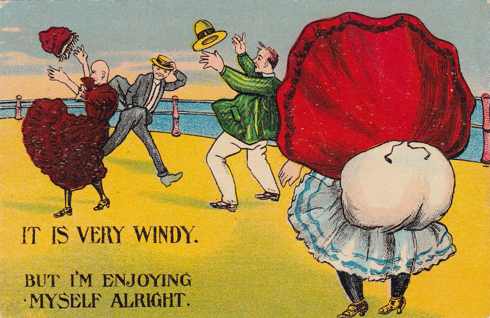
| Version 3 - Modified Mirror Image | ||||||||||||||||||||
|
The top image is the original "FS" signed card - the bottom a mirror image of the mirrored copy. While the main figure outlines are the same, details and the relative positions of the railing are different. As all the mirrored versions are effectively identical they were all produced from the same redrawn master rather than an optical approach from the original master. This suggests they were that these were unofficial copies. as if "F S" had been asked to redraw one would not expect him to do the figures exactly. |
||||||||||||||||||||
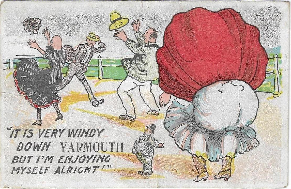 |
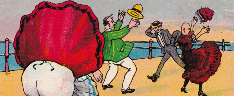
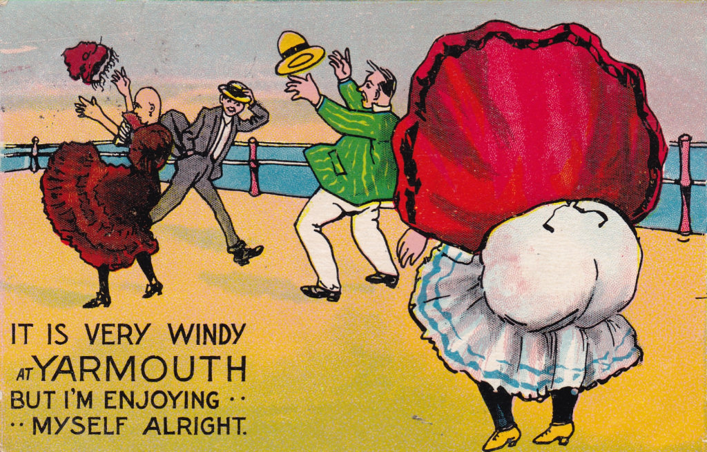
It is very windy down YARMOUTH but I'm enjoying myself alright Unsigned 8 August? 1908 Very early mirror version with different colouring technique. Post 1906 back, but month of posting unclear. |
|
||||||||||||||||||
| It would be interesting to know if there were other cards produced with this extra miniscule picture of the policeman, and if this links the card to a particular publisher. | ||||||||||||||||||||
|
|
It is very windy at YARMOUTH but I'm enjoying myself alright Unsigned 2 September 1911 This is a redrawn mirror version of the basic card with trivial variations and with a place name written in. The back is not one I recognise as being linked to "F S" cards. |
|
||||||||||||||||||
 |
It is very windy but I'm enjoying myself alright Unsigned later version of above with Numbered Back (PC. I) 474 20 August 1913 |
|
||||||||||||||||||
| ?? | Possible Variations: With the name of other seaside resorts ??. | |||||||||||||||||||
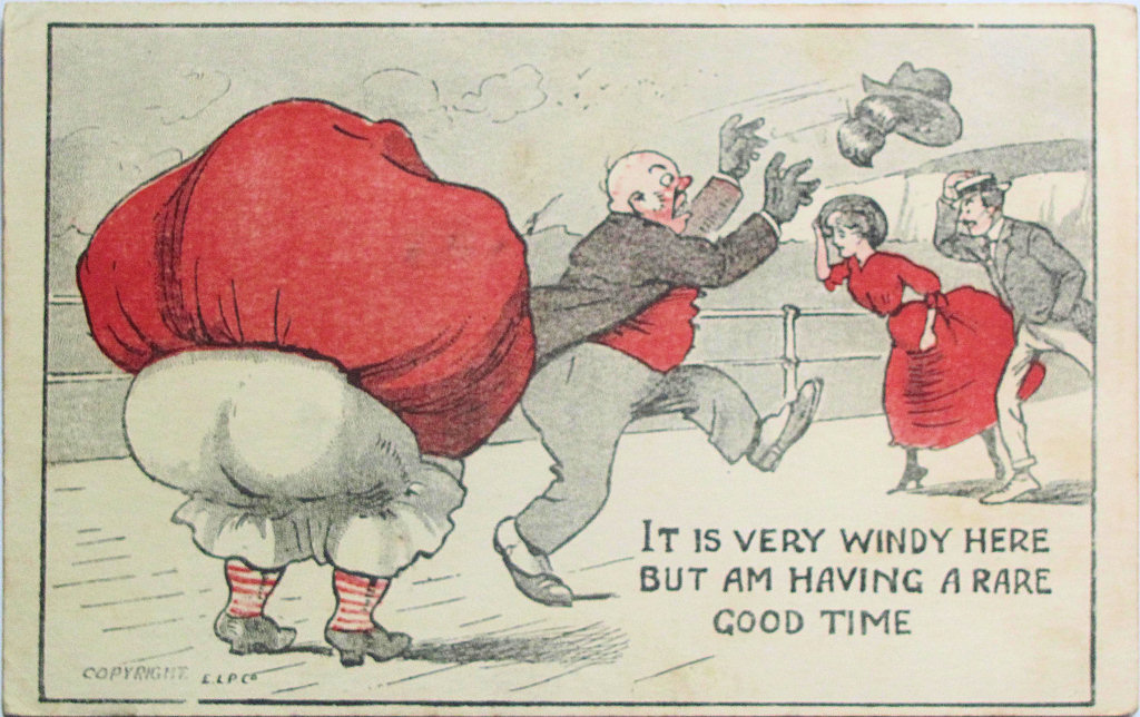
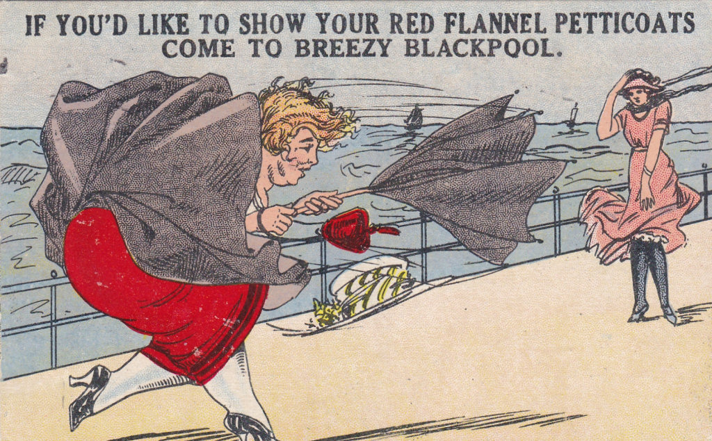
| Version 4 - An East London Publishing Co "Pirated" copy by ??Harry Quinton?? | ||||||||||||||||||||
|
|
It is very windy here but am having a rare good time, Unsigned Copyright E L P Co (East London Publishing Co) [2 October 1912 - also reported 1909] |
|
||||||||||||||||||
|
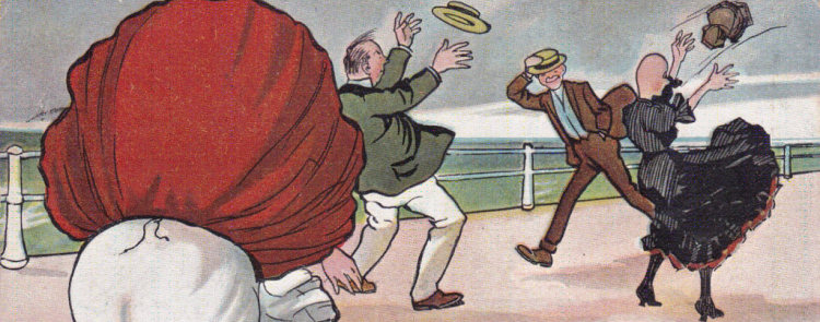
This redrawn version keeps the four original figures, but the further away lady is drawn facing into the wind. The card uses colour far more sparingly. |
||||||||||||||||||||
|
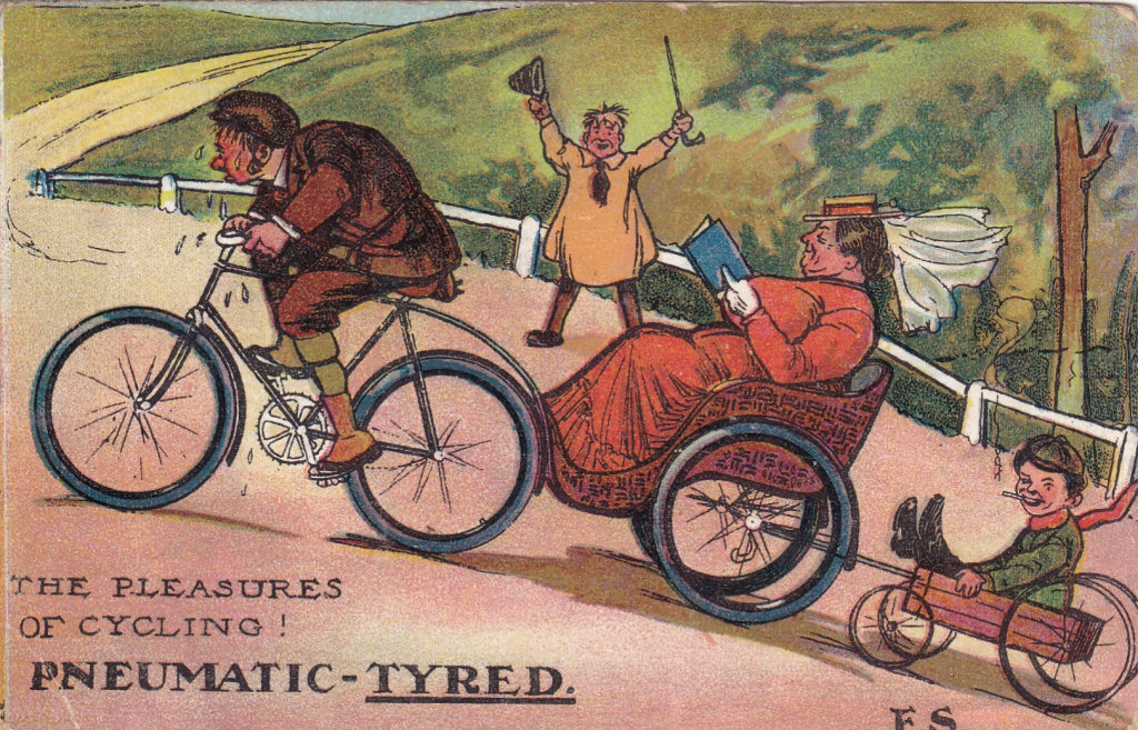
It may be a coincidence, but Anthony Byatt records that the East London Printing Co was publishing post cards by 1908. and the E.L.P.Co on the picture side suggest that this was one of their earliest post cards. This raises the possibility that either there was some connection between the failed London View Co. Ltd. and the East London Printing Co. or more likely the card was an pirated copy, It is interesting to note that Alexander Bloom, of ELP Co., has already run into problems with publishing pirated copies of music hall songs in 1903 and indecent post cards in 1907. There is also the case of redrawn Pleasure of Cycling card he produced.
While there is no artist signature one possibility is Harry Quinton. He was publishing cards in London over the period 1905 to 1907 using one colour and the same post card back - so he may have been using the E.L.P. Co. |
Signed Harry Quinton - copyright - No 39 - H Q, 92 Burrows Road, N W |
|||||||||||||||||||
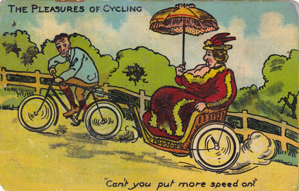
� ELP card Original "F S" card � Is this another case of a pirated "F S" Card printed by ELP Co? Shortly after the London View Co. Ltd. closed a new series of The Pleasure of Cycling appeared (artist unknown) with one obvious card copy. Cards from the revised set carry the publisher names H. Garner and E.L.P. Co |
||||||||||||||||||||
| Version 5 - The "Donald McGill" Look-alike card | ||||||||||||||||||||
 Joseph Asher was definitely selling "F S" cards in 1907, although there is currently no evidence that they sold any of the "Down Here" series with their company name on. If Asher sold the original "F S" card he would not be able to get reprints from the now non-existent London View Company and might have commissioned McGill to produce a similar card. Donald McGill's first post cards appeared in 1905 in the Empire Series (E S) for the Pictorial Postcard Company which closed down in 1908, and it was after this that he started producing cards for Joseph Asher. As far as I know he did not do any cards for the East London Publishing Co. |
||||||||||||||||||||
|
Donald McGill's Fat Lady - Original Version |
||||||||||||||||||||
|
|
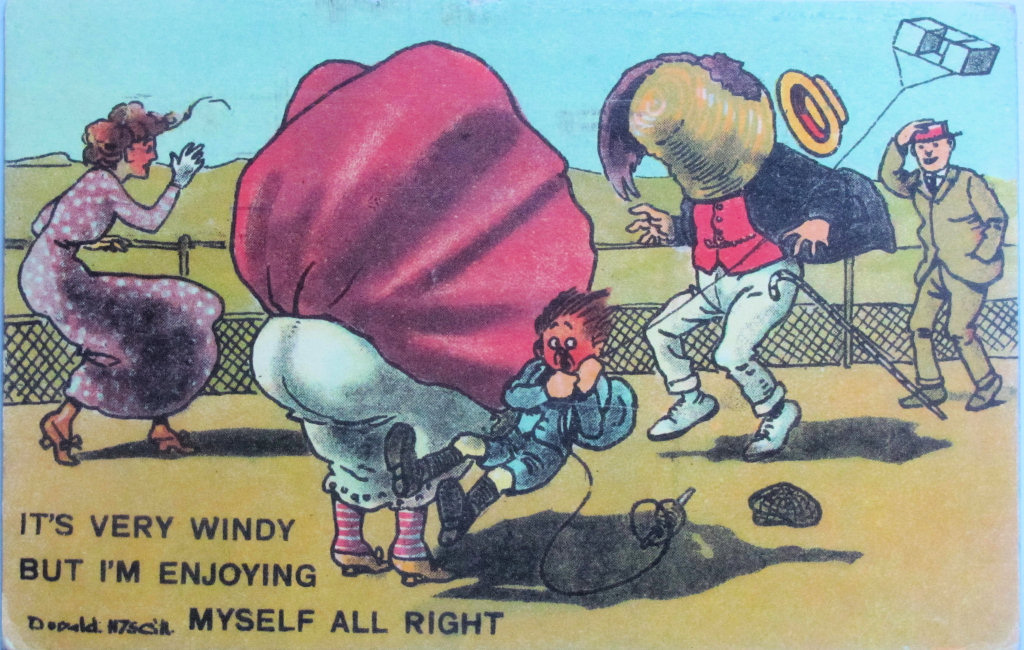
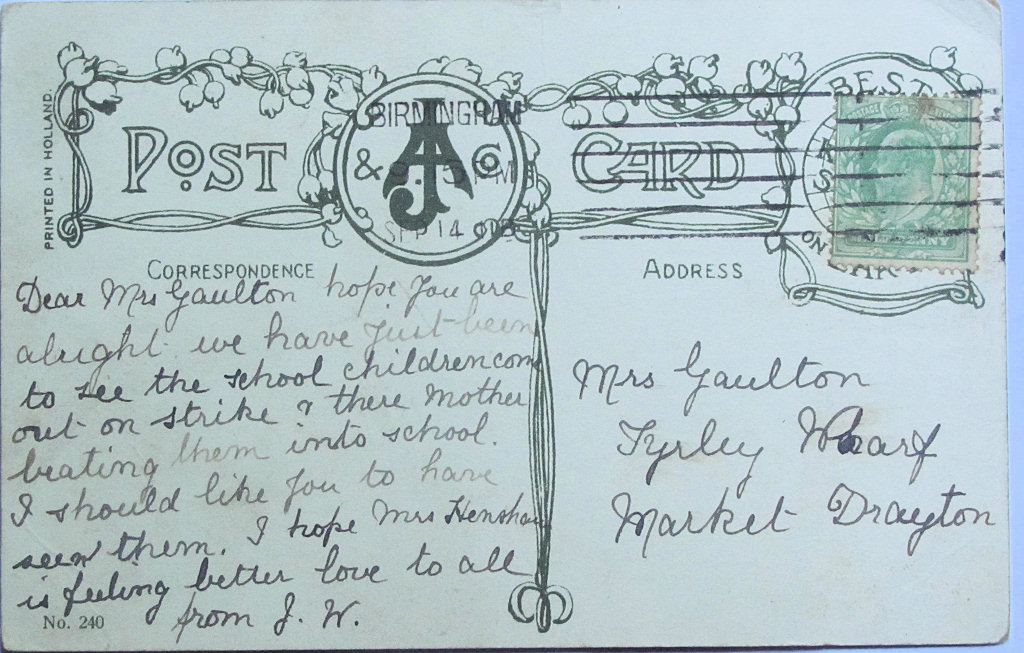
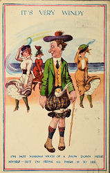
It's very windy but I'm enjoying myself all right Signed Donald McGill Asher Series A 240 |
|
||||||||||||||||||
|
This would appear to be a modified copy of the "F S" image made by Donald McGill. The card was posted in 1908 and this date fits in well with other Joseph Asher Series A numbers. |
The cards also occurs with the words "At Weymouth" posted 24 July 1911 and "At Cleethorpes" posted August 1912, |
|||||||||||||||||||
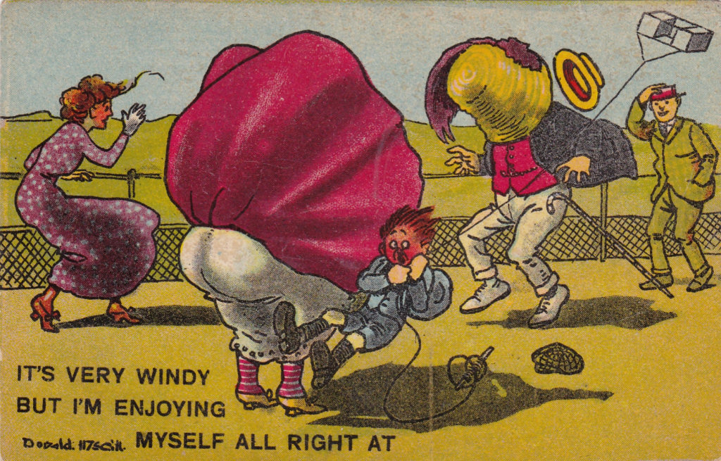 |
It's very windy but I'm enjoying myself all right at .... Signed Donald McGill No Publisher A 240 6 & 8 August 1914 |
|
||||||||||||||||||
|
|
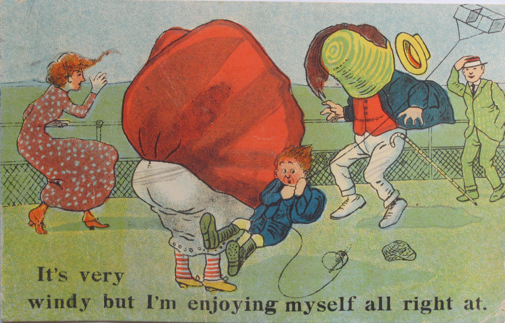
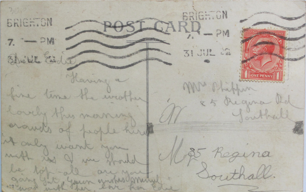
It's very windy but I'm enjoying myself at ... Unsigned No publisher Posted 31 July 1922 |
|
||||||||||||||||||
|
Donald McGill's Fat Lady - Follow Up Version 1 |
||||||||||||||||||||
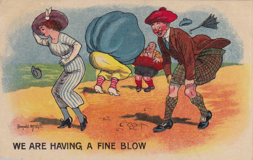 |
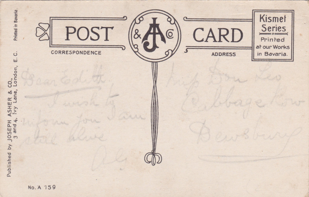
We are having a fine blow signed Donald McGill J A & Co Published by Joseph Asher & Co. 3 & 4 Ivy Lane, London E C. A 159 Kismet Series - Printed in Bavaria |
|
||||||||||||||||||
|
Donald McGill's Fat Lady - Follow Up Version 2 |
||||||||||||||||||||
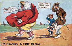
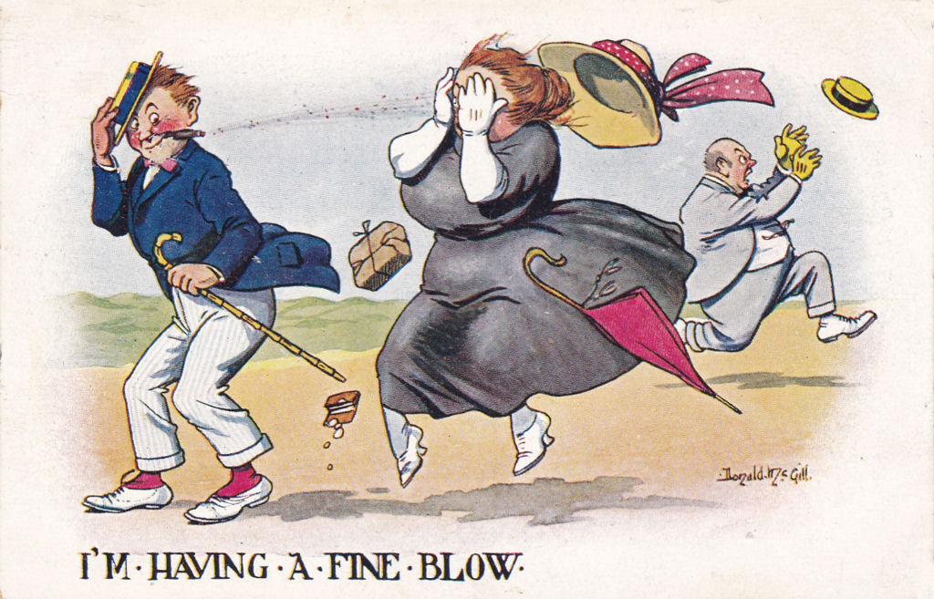 |
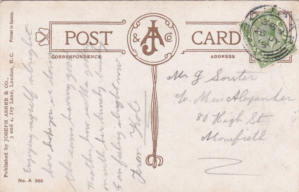
I'm having a fine blow Signed Donald McGill Published by Joseph Asher & Co. 3 & 4 Ivy Lane, London E C. No A 966 -Printed in Saxony Posted 25 July 1915 |
|
||||||||||||||||||
|
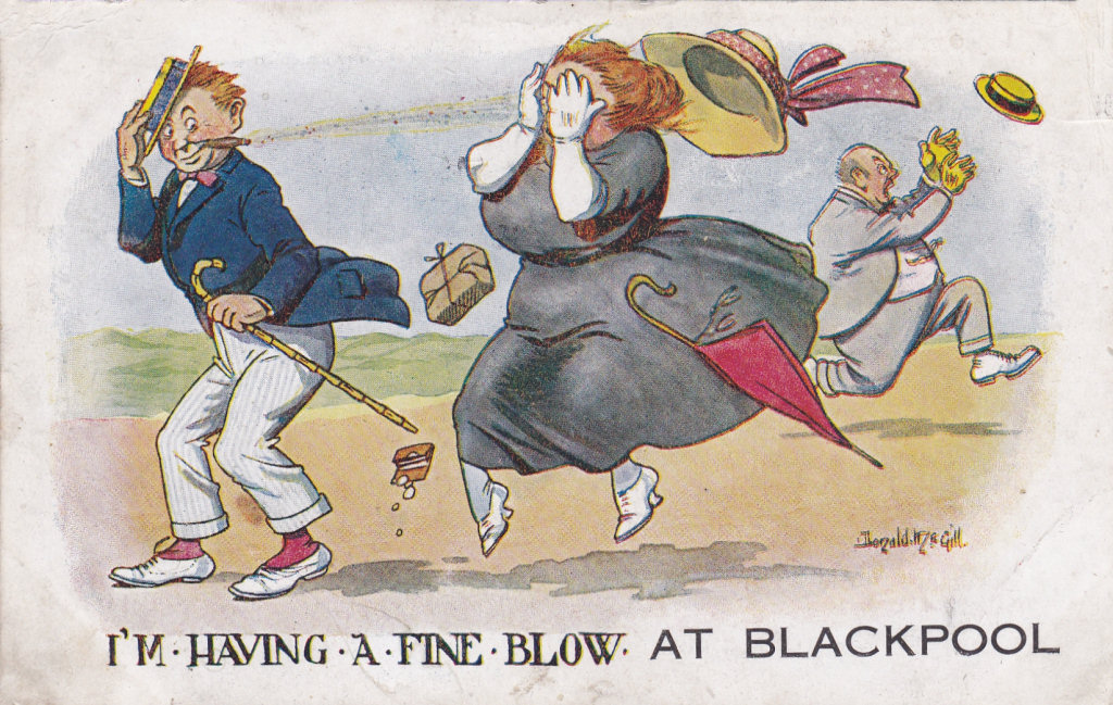
Compare men with "F S" version |
||||||||||||||||||||
|
|
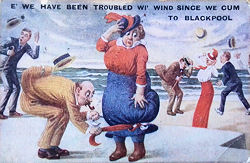
I'm having a fine blow at Blackpool Signed Donald McGill W B 1 Printed in Great Britain Posted 16 July 1915 Also with no place name Posted 1919. .. at Leigh-on -Sea Posted 10 August 1920 |
|
||||||||||||||||||
|
Donald McGill's Fat Lady - Follow Up Version 3 |
||||||||||||||||||||
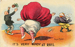
|
|
Its very windy at Rhyl Signed Donald McGill Printed in Bavaria |
|
||||||||||||||||||
 |
Its very windy down here Unsigned No 410 |
|
||||||||||||||||||
|
Donald McGill's Fat Lady - Follow Up Version 4 |
||||||||||||||||||||
|
|
I'm having a fine blow signed Donald McGill No Publisher No 2 Posted 21 July 1922 |
|
||||||||||||||||||
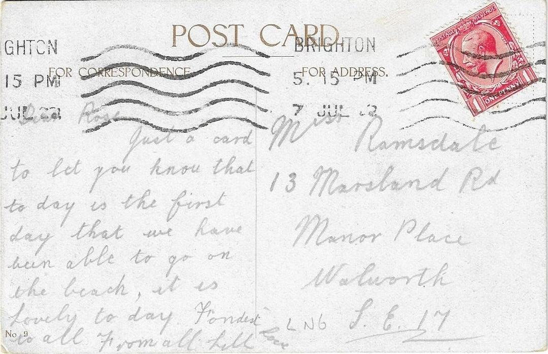
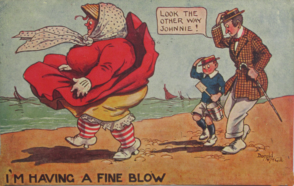
 |
I'm having a fine blow at Brighton signed Donald McGill No Publisher No 9 Posted 15 July 1922 |
|
||||||||||||||||||
|
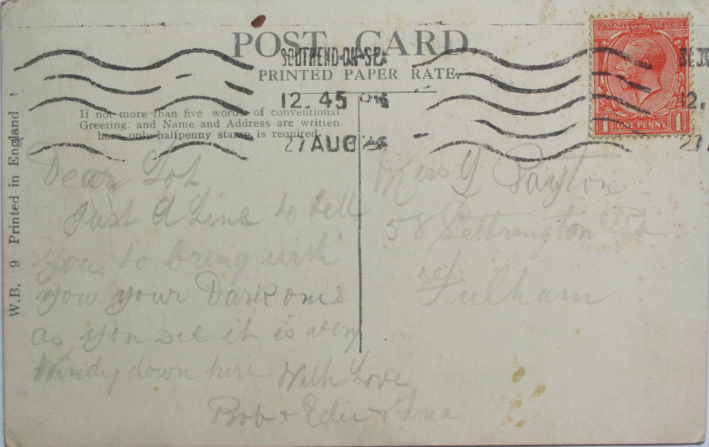
|
I'm having a fine blow signed Donald McGill W. B. 9 Printed in England Posted 27 August 1926 [.. July 1925]
|
|
||||||||||||||||||
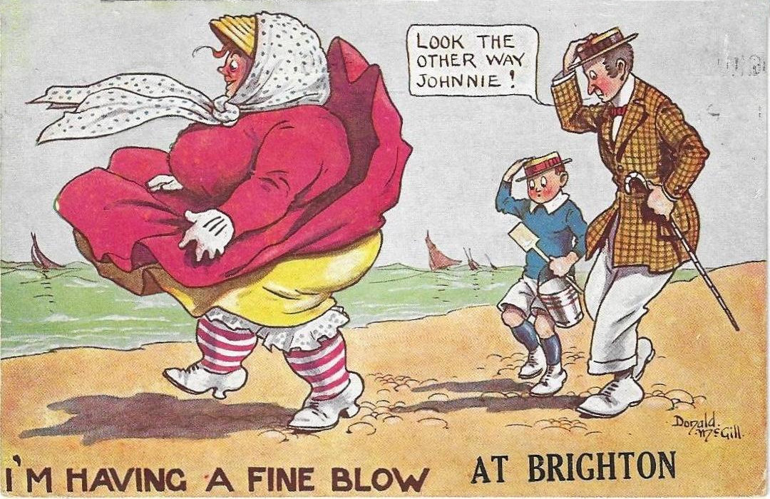
|
Donald McGill's Fat Lady - Follow Up Version 5 |
||||||||||||||||||||
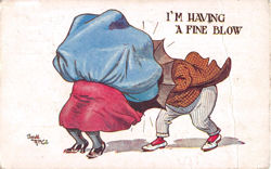
|
|
I'm having a fine blow [at Margate] signed Donald McGill W. B. 91 Printed in England Posted 14 August 1923? |
|
||||||||||||||||||
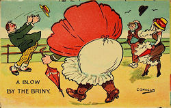
| Version 6 - The "Comicus" Look-alike card | ||||||||||||||||||||
| Harry Parlett, usually signed his name when designing cards for Gotteschalk. Dreyfus & Davis but also produced cards for other publishers such as Tuck, Hutson Brothers, the Midland Pictorial Company and A & G Taylor. He sometimes signed his cards as "H P" or used the name "Comicus". | ||||||||||||||||||||
| A Comicus version of "It is very Breezy" | ||||||||||||||||||||
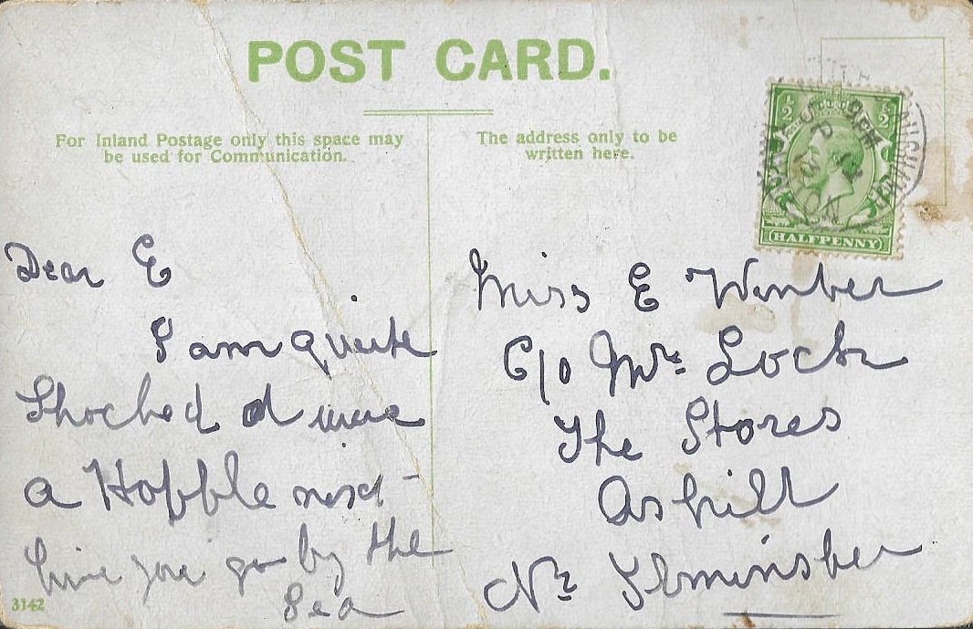
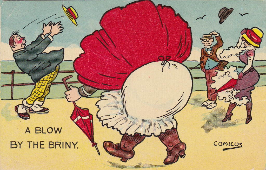 |
A Blow by the Briny Signed Comicus No Publisher - No 3142 Posted 20th July 1912 |
|
||||||||||||||||||
 |
A Blow by the Briny Signed Comicus No Publisher - No 3142 |
|
||||||||||||||||||
 |
A Blow by the Briny Unsigned No Publisher No 3142 12 September 1917 |
|
||||||||||||||||||
|
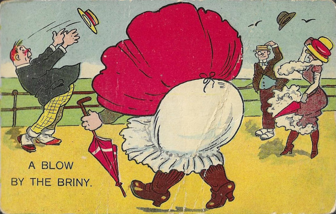
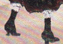
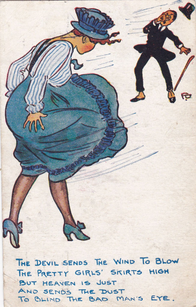
This is clearly a copy of the original "It is very Breezy" card by "F S" which involves reversing the main figure so the wind is blowing the dresses in one direction and hats in the other direction. This suggests a rather mechanical copying to try and avoid copyright as anyone composing the picture would be actively aware of the direction the wind was supposed to be blowing. Despite the pre-1907 style back this is one of many Comicus cards, with identical backs and numbers in range 2904 to 3247 which were posted in 1912 or later by Hutson Brothers. |
||||||||||||||||||||
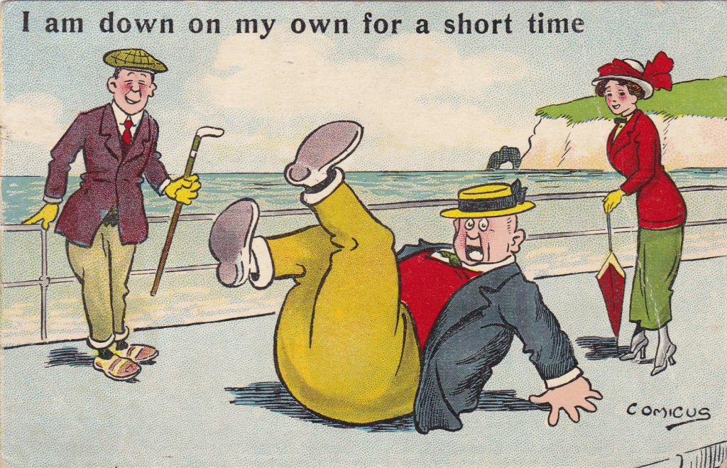
| Some similarities with "It is Very Breezy" and "Her Flowing Locks" | ||||||||||||||||||||
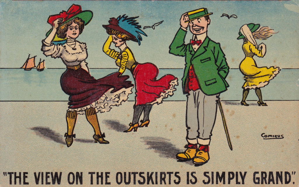 The view on the outskirts is simply grand Signed Comicus - No 2006 - HB Series, London, Printed in Holland Posted 17 August 1911 |
|
I am down on my own for a short time Signed Comicus - No 4034 Posted George V stamp Same back, related theme |
||||||||||||||||||
| The following could be another card where Comicus was mimicking "F S" style? | ||||||||||||||||||||
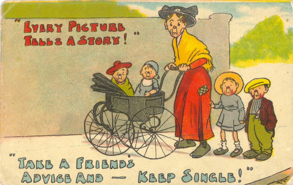 |
Every Picture tells a Story Take a Friend's Advice And stay single No Signature H B Series 930 Printed in Holland 1911 |
While this looks as if it ought to be an "F S" card - echoing two of his sets, the number puts it in a series of cards by Comicus or Harry Pallet (Comicus's real name). So could it be Comicus imitating "F S"? |
||||||||||||||||||
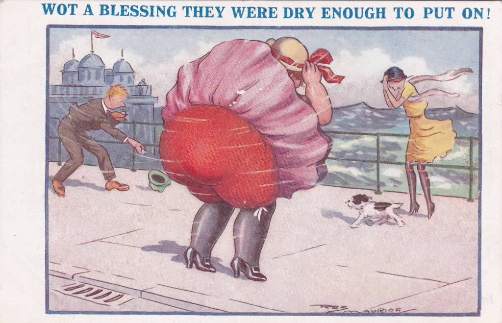
| Version 7 - The "Reginald Maurice" Look-alike card | ||||||||||||||||||||
|
||||||||||||||||||||
|
Re-used Figures signed by "F S" |
||||||||||||||||||||
|
|
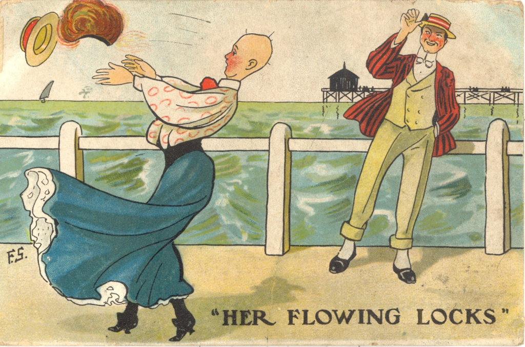
Her Flowing Locks Signed F S London View Company Ltd
4 September 1907 also 24 November 1906 (no publisher) |
 |
||||||||||||||||||
|
|
It is very windy down here but I'm having a jolly good time Unsigned 24 September 1913 |
 |
||||||||||||||||||
|
These cards are of interest because:
|
||||||||||||||||||||
|
Re-used Figures signed by "Fred Spurgin" |
||||||||||||||||||||
|
||||||||||||||||||||
|
Possible reason for redrawn variants of "It is Very Breezy" |
||||||||||||||||||||
|
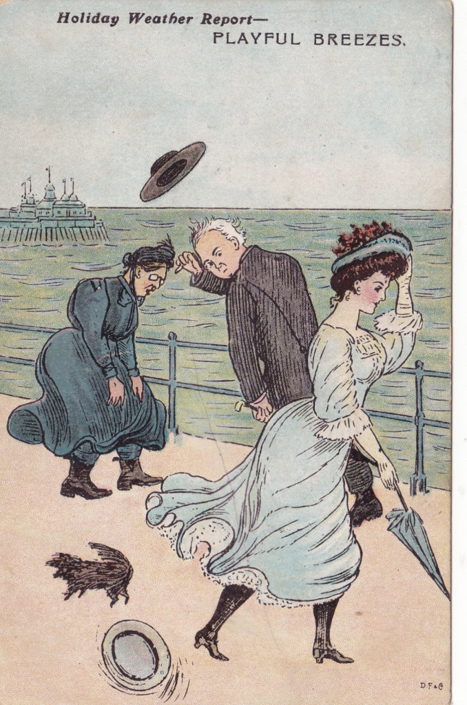
The number of versions of the original post card suggests that it was popular, and was reprinted a number of times, often with no signature, and with changes in the text wording.. I have discovered several versions where the image was redrawn to a greater or lesser extent. All are provisionally dated as 1908 or later and it may be that it is significant that in August 1907 the London View Company went bankrupt. While the evidence is circumstantial the London View Company appears to have been a wholesaler who supplied "F S" cards with backs where the publisher name varied or was absent. Companies who had been supplied with the "F S" cards in 1906/7 would therefore be unable to order additional copies for the 1908 seaside season and may have asked other artists to produce "something similar" believing the changes were sufficient to avoid copyright problems. In every case where there is such a "pirated" copy the back is not one I associate with genuine "F S" or London View CO. Ltd. post cards. |
||||||||||||||||||||
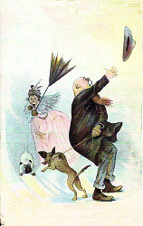
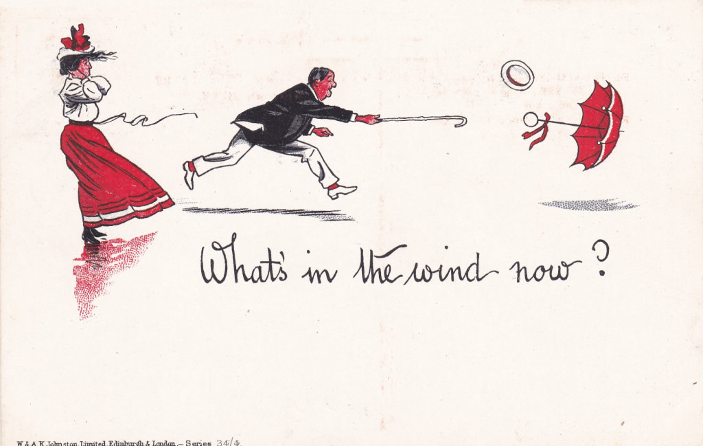
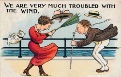
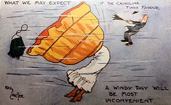
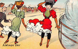
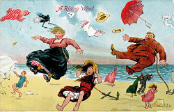
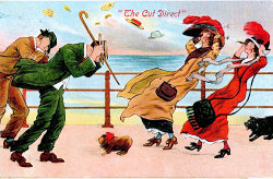
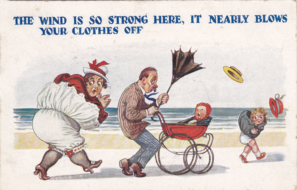
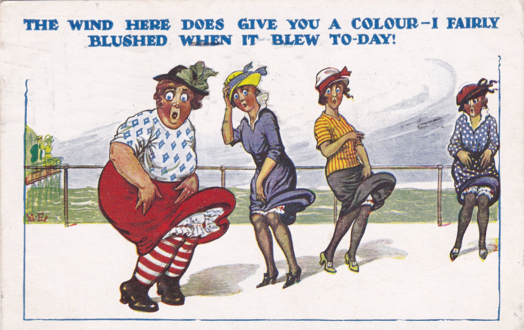
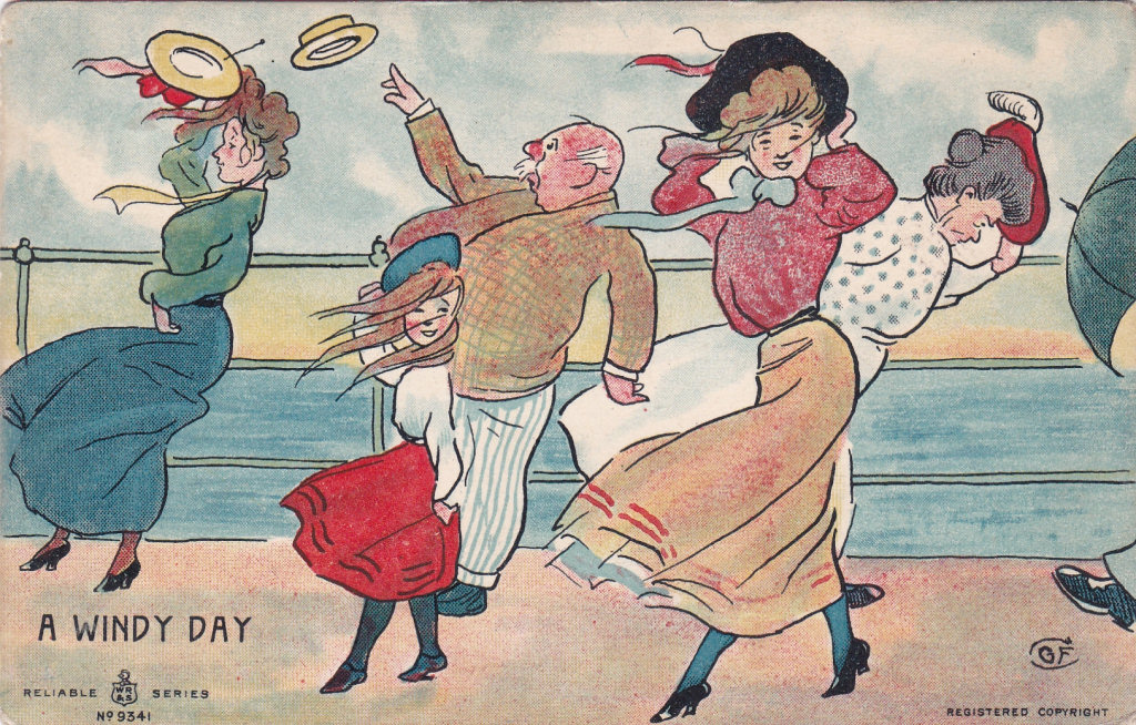
| Some Other Windy Day cards for comparisom | ||||||||||||||||||||
|
||||||||||||||||||||
|
||||||||||||||||||||
.jpg)


%20x.jpg)